Belvedere Landscape Design
Belvedere Landscape Design is a landscape architecture company. The company is a homegrown idea, designing landscapes for the DIYer to upgrade their yard, providing them with softscape and/or hardscape designs in color and 3D renderings. They were looking for a logo to be made for their up and coming company.
LOGO design
To start the process I asked my client to show me a few logo’s that drawled their attention and was more in harmony with who they are. After understanding BLD (Belvedere Landscape Design) better and what they were aiming for, I was able to come out with different styles that were far left and right of what they wanted, allowing them to see and feel how the direction their logo can bring them.
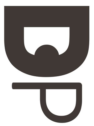
The concept of this logo was based on the idea of modern simplicity and home style comfort feel. We came down to a seal design that incorporated a shovel the icon for the logo. Then using the BLD as the acronym for Belvedere Landscape Design, we fused a topography design with the typography.
LOGO VARIATION
Above were the last few logo variation that were made for the client. The seal and the shovel was already decided on as a keeper. It came down to how they wanted the look and feel of the initials BLD. Client was looking at thin Sans Serif typography, but I suggested using a bold style as were using a thin typography for the name already. Also pointed out to them that with BLD, it sounded and looked BOLD, which would allow it to stand out on its own. This worked out perfectly as the bold font allowed more freedom to incorporate the topography into the design.